I randomly came across this video on youtube when I clicked on the wrong link by accident and I was pleasantly surprised by my find. I think this is a wonderful video, very imaginative. I also thought it was a great find as it relates to our daydream animation project we were assigned.
Fun Facts:
* The video was shot all stills - roughly 3225 still photos for the entire video, using one camera, hanging from the ceiling for the main body of the movie.
* It took 4 weeks before shooting to create an animated computer generated storyboard for the video, with 3d dummies for the characters.
* It took only 2 days of shooting for the live actors on set to re-create the 3.5 minutes computer sequence, frame by frame.
Friday, 17 July 2009
Monday, 13 July 2009
Yet more illustrations...Matthew Woodson

I found this illustrator while looking for work similar to the style of Russ Mills, an illustrator I really admire.
At first I just briefly glanced at a few images from Matthew Woodson, It didn't excite me at first, the images seemed quite plain, until I came across this image of a woman smoking a cigarette in which the smoke takes the form of a skeleton with it's arms around her

I thought this was a really powerful image with a subtle message. Like I said before I love illustrations that tell a story, ones that make you wonder what happens next and alot of Matthew Woodson's images make me think this way. The illustrations are all very cleanly created using illustrator, and they look like they were all really well thought out.


Woodson's illustration style reminds me a lot of the movie A Scanner Darkly it's very weird but I recommend people having a look at it as the style is awesome.
Matthew Woodson
A Scanner Darkly Trailer
Sunday, 12 July 2009
Local Artist - Ryan O'neill
Here is some work from a young up and coming local artist/illustrator Ryan O'niell, who actually happens to be a friend of mine.
I've admired his work for sometime now. I'm always in awe when I see a new piece of work he has created. Although he would mainly be praised for his beautiful, realistic oil paintings, I feel his illustration work is just as dynamic. They're so simple yet powerful and imaginative, each one tells a unique story. It may not be to every ones taste, but i'm a big fan of quirky illustrations. Illustrations that you could look at for hours wondering what is going on and what will happen next. Ryan brings a sense of humour to his work, so you don't have to take it too seriously.
 I love the amount of detail in this particular illustration. It is drawn with such precisson and attention to detail using only pens and markers. I think its funny how he incorporates Belfast into his work, it makes me think of someone sitting at city hall waiting for their bus and day dreaming about this event. I think the illustration is trying to show how much people are like zombies on their way to work.


He is also a big fan of the sketchbook. He always has his with him at all times ready to sketch out his ideas. I believe his work is just as strong as the number of illustrators on the illustration agency website we have come across. I think it's great that there is still such strong talent coming from Northern Ireland and many new artists that have still to be discovered.
Sadly his online illustration portfolios are limited but I think they are worth a good look around and i'm sure he'll add more soon.
About-Things
DeviantART
I've admired his work for sometime now. I'm always in awe when I see a new piece of work he has created. Although he would mainly be praised for his beautiful, realistic oil paintings, I feel his illustration work is just as dynamic. They're so simple yet powerful and imaginative, each one tells a unique story. It may not be to every ones taste, but i'm a big fan of quirky illustrations. Illustrations that you could look at for hours wondering what is going on and what will happen next. Ryan brings a sense of humour to his work, so you don't have to take it too seriously.
 I love the amount of detail in this particular illustration. It is drawn with such precisson and attention to detail using only pens and markers. I think its funny how he incorporates Belfast into his work, it makes me think of someone sitting at city hall waiting for their bus and day dreaming about this event. I think the illustration is trying to show how much people are like zombies on their way to work.


He is also a big fan of the sketchbook. He always has his with him at all times ready to sketch out his ideas.
 I believe his work is just as strong as the number of illustrators on the illustration agency website we have come across. I think it's great that there is still such strong talent coming from Northern Ireland and many new artists that have still to be discovered.
Sadly his online illustration portfolios are limited but I think they are worth a good look around and i'm sure he'll add more soon.
About-Things
DeviantART
Thursday, 9 July 2009
Progression.
Thanks to twitter, I found a link to this post showing how far a select number of designers have come in the design world. I thought this was really interesting and quite inspiring as it reminds us that not everyone starts out as a great designer with dynamic ideas, It takes years of practice and dedication to develop unique ideas and designs.
Enjoy
Logo Designers Share Their First And Last Logos
Enjoy
Logo Designers Share Their First And Last Logos
Sunday, 5 July 2009
My love of nature and typography, together at last

I just stumbled upon an article in Creative review (from Feb 09) about an artist named Russel Coleman and a team of collaborators who have created a series typographic tree sculptors for a library.

The trees have paragraphs of text carefully selected by the users of the Crawley Library carved into them in a font that the artist felt best suited each particular piece of text. I think this is an amazing idea they're so beautifully created with care and attention to detail. Maybe not the most eco-friendly project in the world but beautiful none the less.
Creative Review
Why Not Associates
Thursday, 2 July 2009
looking back
 Since I have completed my first year of Vis Com, I thought a little reflection was in order.
Over this year I feel I've learnt a lot of new skills that I'll need to succeed in the design world. I still have much more to learn but I'm excited to get started again. The following are pieces of work that I enjoyed working on most and am pleased with the finished result.
Book Cover Design;
Create two covers for each book, one must be an image one must be type.
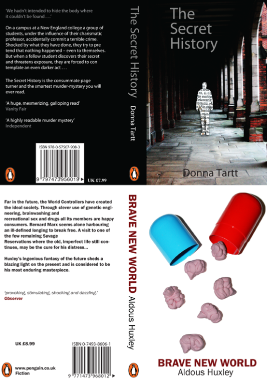
When I began this project I wasn't exactly sure where to start. Considering I didn't have enough time to actually read the books (I'm not one for reading books) I search the internet for brief summary's of the books and picked out the main themes and words that were associated with the books. After that I began to sketch out my ideas, one thing led to another and I ended up with these covers. I really enjoyed this project. It was challenging and something i'd never done before. I'm happy with my finished covers and had a lot of fun making little brains!
Guardian Project;
For this project we had to create a guardian supplement in the same style as the guardian.
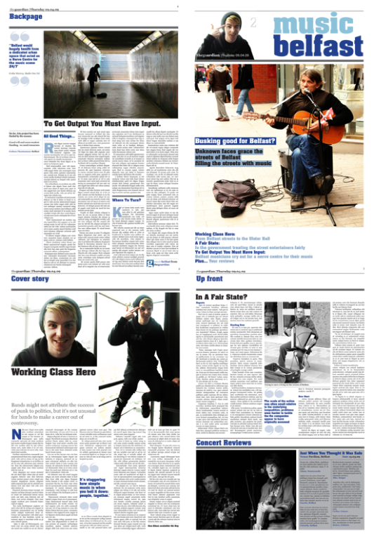 I thought this project would be really easy, but it was quite complicated when I listed out all the changes that where required to make my layout fit in with the rest of the newspaper. This was surprisingly very fun, I really enjoyed making all the small changes such as selecting the right font, creating the same quotation marks, organising the paragraphs. It took some time but I think my outcome is very successful.
Modular World Project;
This project consisted of creating fonts and characters using only modular shapes.
This was by far my favourite project that we were assigned. At first I found it quite difficult but once I played about with the shapes and began to develop my ideas I began to really enjoy the freedom we were given with the brief.
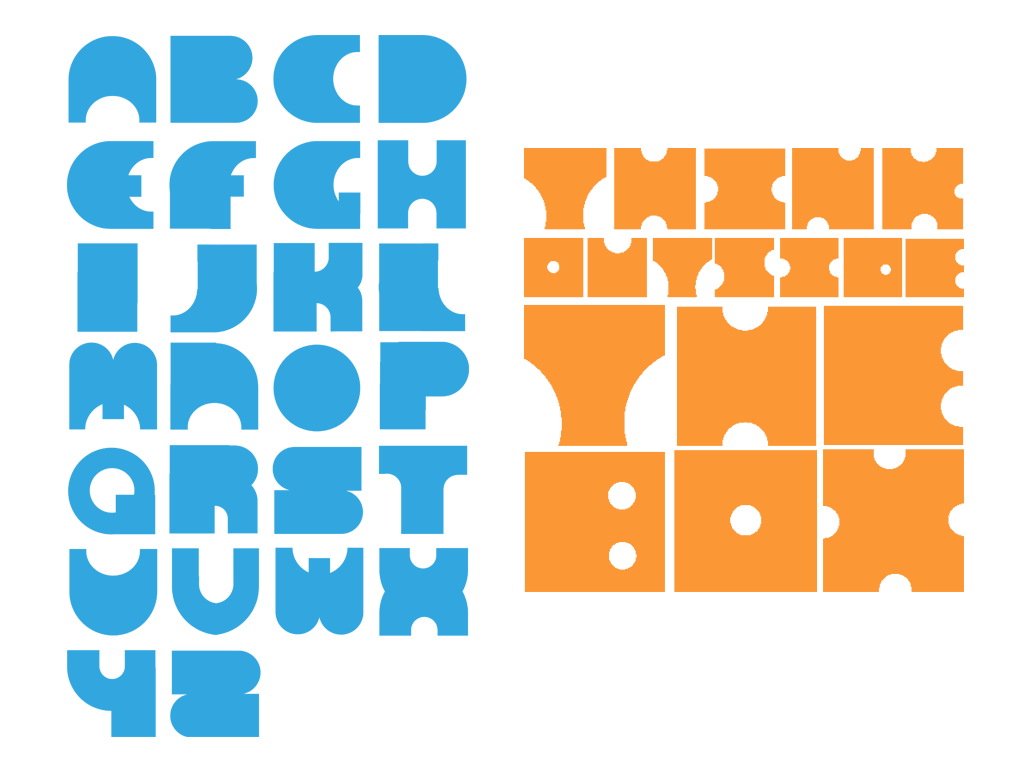
I loved creating these fonts. I found them quite easy to create, the shapes just made sense as letters. I think my fonts are quite simple but still dynamic and original. I also thought they were very legible in the form of words. Really pleased with the out come of these.
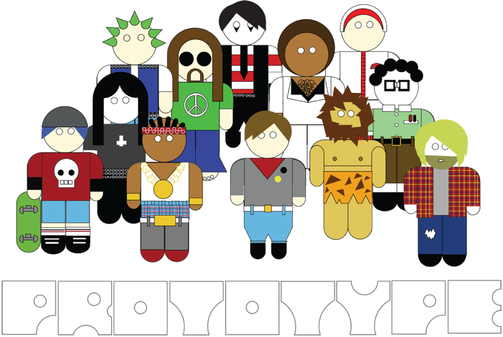 Moving onto characters, I started with a very basic human shape and began to create clothing and accessories using the shapes to make the characters look like playful cultural stereotypes such as punk, grunge etc. This took quite a lot of time and effort but it was very fun to do.
Some small examples of my first year work. I shall upload a few more to my deivantART account and post the link in another post.
It's funny how quickly first year has come and gone.... scary actually. Roll on second year!
Start Something (again)
So i’ve created my fantastic blog.
A place were my epic random thoughts come together in paragraphs that probably wont make much sense, and for that I apologise, but I shall try my best to keep the design world entertained.
Design wise, my blog isn’t looking to good. At the moment I have about 4 different blues going on, and the headers blurry… but it’s my first attempt.
I've decided to use blogger mainly but i'll still update the wordpress blog with the same crap. follow which ever one you like best
Wordpress or Blogger?
ok, so i've set up a new blog with Blogger.
Wordpress is VERY hard to use and I don't like how it's too hard to customise.Cconfusion.
I'll keep both blogs to see with one I like best and simply delete the one I like less! Great idea I think.
Wordpress is VERY hard to use and I don't like how it's too hard to customise.Cconfusion.
I'll keep both blogs to see with one I like best and simply delete the one I like less! Great idea I think.
Subscribe to:
Posts (Atom)